Tableau is a powerful tool for visualizing data, but when working with large data sets, performance can sometimes become an issue. Slow dashboards and lagging queries can frustrate users and hinder decision-making. Fortunately, there are several strategies you can implement to optimize Tableau's performance when handling large volumes of data. In this blog, we'll explore best practices to ensure your Tableau workbooks run smoothly and efficiently, even with large data sets.
The first step to improving Tableau performance is optimizing your data sources:
Your dashboard design can have a significant impact on performance:
Tableau offers built-in tools to help you identify and address performance bottlenecks:
When working with large data sets, it's essential to ensure that calculations and data blending are optimized:
For enterprise-level solutions, Tableau Server and Tableau Online offer additional options for optimizing performance:
Finally, ongoing monitoring and tuning are crucial for maintaining optimal performance:
Optimizing Tableau performance for large data sets requires a combination of data source management, efficient dashboard design, and regular monitoring. By implementing these best practices, you can ensure that your Tableau workbooks run smoothly and provide fast, reliable insights, even when handling large volumes of data. Whether you're an analyst or a business leader, a well-optimized Tableau environment will empower you to make data-driven decisions with confidence.
In the rapidly evolving world of data analytics, staying ahead of the curve is essential for businesses and professionals alike. As organizations increasingly rely on data-driven decision-making, the tools and technologies used to analyze and visualize data are also advancing. Tableau, a leading data visualization platform, is at the forefront of this transformation. In this blog, we'll explore the future of data analytics and Tableau's role in shaping emerging trends.
One of the most significant trends in data analytics is the rise of self-service analytics. As organizations seek to empower employees to make data-driven decisions, there is a growing demand for tools that enable non-technical users to access and analyze data independently. Tableau's intuitive drag-and-drop interface and robust visualization capabilities make it an ideal solution for self-service analytics. By democratizing data access, Tableau allows users across the organization to explore data, generate insights, and make informed decisions without relying on IT or data specialists.
Artificial intelligence (AI) and machine learning (ML) are transforming the way data is analyzed and interpreted. These technologies can uncover patterns and trends that are not immediately apparent to human analysts. Tableau is increasingly integrating AI and ML capabilities into its platform, enabling users to leverage advanced analytics without requiring deep technical expertise. Features like "Explain Data" and "Ask Data" allow users to ask natural language questions and receive insights generated by AI algorithms, making complex data analysis more accessible.
In today's fast-paced business environment, the ability to analyze data in real time is crucial. Real-time analytics allows organizations to respond quickly to changing conditions, optimize operations, and make timely decisions. Tableau's support for live data connections and real-time dashboards enables users to monitor key metrics and performance indicators as they happen. This capability is particularly valuable in industries like finance, healthcare, and retail, where timely insights can have a significant impact.
As data becomes an increasingly valuable asset, ensuring its accuracy, security, and compliance is more important than ever. Data governance involves establishing policies and procedures for managing data throughout its lifecycle. Tableau's data management capabilities, including data cataloging, data lineage, and role-based access controls, help organizations maintain data quality and compliance. By providing a centralized platform for managing and governing data, Tableau supports organizations in building trust in their data and analytics.
Cloud computing is revolutionizing the way data is stored, processed, and analyzed. The shift to cloud-based analytics offers numerous benefits, including scalability, flexibility, and cost savings. Tableau's cloud offerings, such as Tableau Online and Tableau Server on cloud platforms, enable organizations to deploy and manage their analytics infrastructure in the cloud. This allows for seamless access to data and analytics from anywhere, facilitating collaboration and supporting remote work.
Collaboration and data storytelling are becoming increasingly important in data analytics. Tableau's collaboration features, such as shared dashboards, commenting, and version history, enable teams to work together and share insights effectively. Additionally, Tableau's visualization capabilities support data storytelling by allowing users to create compelling and interactive visualizations that communicate complex data in a clear and engaging way. By fostering collaboration and enhancing communication, Tableau helps organizations build a data-driven culture.
The future of data analytics is dynamic and full of opportunities. Tableau's role in emerging trends, such as self-service analytics, AI and machine learning, real-time analytics, data governance, cloud-based analytics, and enhanced collaboration, positions it as a key player in the evolving landscape of data analytics. As organizations continue to embrace data-driven decision-making, Tableau's innovative tools and features will play a crucial role in enabling users to uncover insights, tell compelling data stories, and drive business success.
In today's data-driven world, storytelling through data is more critical than ever. Tableau Public offers a powerful platform to share and showcase your data stories with a global audience. Whether you're a data enthusiast, analyst, or storyteller, Tableau Public provides the tools to create and publish compelling visualizations. In this blog, we'll explore how to effectively use Tableau Public to share and showcase your data stories.
Tableau Public is a free platform that allows users to create and share interactive data visualizations online. It's an excellent tool for anyone looking to build a portfolio, share insights, or explore data. Unlike the paid versions of Tableau, Tableau Public requires users to save their work to the cloud, making it accessible to anyone with an internet connection.
Tableau Public isn't just a platform for publishing visualizations; it's also a vibrant community of data enthusiasts. You can explore a wide range of public dashboards, follow other users, and get inspired by their work. Engage with the community by leaving comments and sharing your favorite visualizations.
Tableau Public is an invaluable tool for anyone looking to share and showcase their data stories. By following best practices and leveraging Tableau Public's features, you can create compelling visualizations that captivate and inform your audience. Whether you're building a portfolio, sharing insights, or exploring new data, Tableau Public offers endless possibilities for data storytelling.
In the modern workplace, collaboration and data-driven decision-making are essential for success. Integrating Power BI with Microsoft Teams provides a seamless way to combine data analytics and team collaboration, enhancing productivity and ensuring that everyone is on the same page. This blog explores the benefits and steps to integrate Power BI with Microsoft Teams for enhanced collaboration.
Ensure that your organization has both Power BI and Microsoft Teams set up. Users should have the necessary licenses and permissions to access Power BI reports and Teams channels.
Publish your Power BI reports to the Power BI service. Ensure that the reports are shared with the appropriate audience and have the necessary permissions set.
With the Power BI report embedded in the Teams channel, team members can:
Integrating Power BI with Microsoft Teams transforms how teams collaborate around data. By bringing data analytics into the collaborative environment of Teams, organizations can improve decision-making, enhance productivity, and ensure alignment across teams. Follow the steps and best practices outlined in this blog to leverage the full potential of Power BI and Microsoft Teams for enhanced collaboration.
In today's data-driven world, businesses rely on tools like Power BI to visualize and analyze their data. However, with great power comes great responsibility. Ensuring the security of your data in Power BI is crucial for maintaining trust and compliance. This blog explores the best practices for data protection and governance in Power BI.
Power BI, a business analytics service by Microsoft, enables users to visualize data and share insights across their organization. While it offers robust security features, understanding and implementing best practices is vital to protect your data from unauthorized access and breaches.
Azure Active Directory (AAD) Integration: Power BI integrates with Azure Active Directory, providing a secure way to manage user identities and access. Ensure all users authenticate through AAD to leverage its advanced security features, such as multi-factor authentication (MFA).
Role-Based Access Control (RBAC): Implement RBAC to grant permissions based on users' roles within the organization. This limits access to sensitive data to only those who need it, reducing the risk of data leaks.
Encryption at Rest: Power BI encrypts data at rest using Azure SQL Database Transparent Data Encryption (TDE). This ensures that your data is secure even when stored.
Encryption in Transit: Data transmitted between Power BI and other services is encrypted using HTTPS. Make sure all connections are encrypted to protect data during transmission.
Data Classification: Classify your data based on its sensitivity. This helps in applying appropriate security measures to different data types, ensuring sensitive data is well-protected.
Data Loss Prevention (DLP): Implement DLP policies to monitor and protect sensitive information. These policies can prevent unauthorized sharing of data, ensuring compliance with regulations.
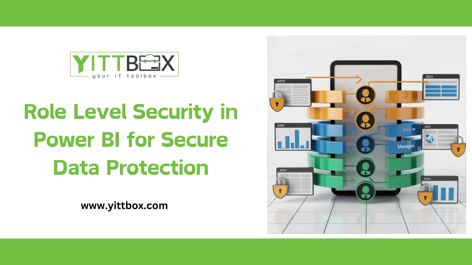
Implement RLS: Row-Level Security allows you to control access to data at the row level. By defining security roles and rules, you can ensure users only see the data they are authorized to view.
Activity Monitoring: Regularly monitor user activities and access logs. Power BI provides audit logs that help track user activities, identifying any unusual or unauthorized actions.
Audit Logs: Enable audit logging to maintain records of who accessed the data and what actions they performed. This is crucial for compliance and identifying potential security breaches.
Content Packs and Workspaces: Use content packs and workspaces to share reports and dashboards securely. Control who can view or edit content, ensuring only authorized personnel have access.
Power BI Service and Power BI Report Server: Choose the right deployment option (cloud or on-premises) based on your organization's security requirements. Power BI Report Server offers enhanced security for on-premises deployments.
Stay Updated: Regularly update Power BI and related services to the latest versions. Updates often include security patches that protect against newly discovered vulnerabilities.
Security Audits: Conduct regular security audits to identify and address potential weaknesses in your Power BI environment. This proactive approach helps in maintaining robust security.
Power BI is a powerful tool for business analytics, but securing your data is paramount. By following these best practices for data protection and governance, you can ensure that your data remains secure and compliant with industry standards. Implementing robust security measures not only protects your data but also builds trust with stakeholders, paving the way for successful data-driven decision-making.
Stay vigilant, stay secure, and leverage the full potential of Power BI with confidence.
Power BI is a powerful tool for data analysis and visualization, but to get the most out of it, ensuring that your reports are fast and responsive is crucial. Slow performance can frustrate users and hinder decision-making. In this blog, we will explore best practices for optimizing Power BI performance, helping you create faster, more efficient reports.
Before diving into optimization techniques, it's important to understand the factors that can affect Power BI performance. These include:
One of the most effective ways to improve Power BI performance is to optimize your data model. Here are some tips:
Eliminate any columns and rows that are not needed for your analysis. This reduces the size of your data model and speeds up processing.
Aggregations allow you to pre-calculate and store summarized data. This can significantly reduce the amount of data that needs to be processed when generating reports.
Using a star schema for your data model can improve performance. A star schema organizes data into fact tables and dimension tables, making it easier and faster to query.
Efficient DAX calculations are key to improving Power BI performance. Here are some tips:
Measures are calculated at query time and are generally faster than calculated columns, which are calculated during data load.
Iterator functions like SUMX and FILTER can be slow because they process data row by row. Try to use aggregations like SUM and AVERAGE instead.
Using variables in DAX can improve performance by reducing the number of calculations performed. Variables store the result of a calculation and reuse it, instead of recalculating each time.
The performance of your data sources directly affects Power BI performance. Here are some tips:
Query folding pushes transformations back to the data source, allowing the source to perform the heavy lifting. This can significantly improve performance.
For large datasets, consider using DirectQuery mode instead of Import mode. DirectQuery retrieves data directly from the data source at query time, reducing memory usage.
Ensure that your queries are efficient. Use indexes, avoid complex joins, and reduce the amount of data retrieved by filtering at the source.
Visualizations are at the heart of Power BI reports, but they can also impact performance. Here are some tips:
Too many visuals on a single report page can slow down performance. Try to limit the number of visuals and avoid unnecessary ones.
Complex visuals with many data points can be slow to render. Simplify your visuals by reducing the number of data points displayed.
Choose the right visual type for your data. Some visuals, like tables and matrices, can be slower to render with large datasets. Use charts and graphs when possible.
Regularly monitor and diagnose performance issues to keep your Power BI reports running smoothly. Here are some tips:
Power BI's Performance Analyzer tool helps you identify performance bottlenecks in your reports. Use it to analyze the performance of individual visuals and optimize them.
Large dataset refreshes can impact performance. Monitor your refresh schedules and optimize them to avoid performance degradation.
The Power BI service provides metrics that can help you monitor performance. Use these metrics to identify and address performance issues.
Optimizing Power BI performance is essential for creating fast and responsive reports that enhance the user experience and facilitate better decision-making. By following best practices for data modeling, DAX calculations, data sources, and visualizations, you can significantly improve the performance of your Power BI reports.
Regular monitoring and performance diagnostics are also crucial to maintaining optimal performance. By leveraging tools like Performance Analyzer and Power BI service metrics, you can proactively identify and address performance bottlenecks.
Start implementing these best practices today to take your Power BI reports to the next level and ensure that your users have the best possible experience.
In today's data-driven world, the ability to visualize data effectively is crucial for making informed business decisions. Power BI, a powerful business analytics tool by Microsoft, allows users to create interactive and immersive visualizations. While Power BI offers a wide range of built-in visuals, custom visualizations can take your reports to the next level, providing tailored insights and enhancing the overall user experience.
Custom visualizations in Power BI provide several advantages over standard visuals:
Creating custom visualizations in Power BI may seem daunting, but with the right tools and resources, it becomes manageable. Here are the steps to get you started:
Before diving into the creation process, clearly define what you want to achieve with your custom visualization. Consider the type of data you are working with, the insights you want to convey, and the audience for your report.
Microsoft provides a Custom Visual SDK that simplifies the process of creating custom visuals. The SDK includes tools and libraries that help you develop, test, and deploy your visuals.
Developing a custom visual involves writing code, typically in TypeScript and using the D3.js library for data manipulation and visualization. Here’s a simplified overview of the development process:
Once your visual is developed and tested, you can package it for distribution. Power BI visuals can be shared internally within your organization or published to the Microsoft AppSource for public use.
To ensure your custom visualizations are effective and user-friendly, consider the following best practices:
While it may be tempting to create complex visuals, simplicity often leads to better understanding and usability. Focus on conveying the most important insights clearly.
Your visualizations should be responsive, adapting to different screen sizes and resolutions. This ensures that users have a consistent experience across various devices.
Large datasets can slow down your visuals, affecting the user experience. Optimize your code to handle data efficiently and ensure quick rendering times.
Interactive elements, such as tooltips, filters, and drill-down capabilities, can make your visualizations more engaging and informative. Users should be able to explore the data easily.
Ensure that your custom visuals are accessible to all users, including those with disabilities. Follow accessibility guidelines and provide alternative text and keyboard navigation support.
Custom visualizations can be applied across various industries and use cases. Here are a few examples:
In the financial sector, custom visuals can be used to create advanced charts and graphs that illustrate market trends, portfolio performance, and risk assessments.
Healthcare providers can use custom visuals to track patient outcomes, visualize medical research data, and monitor hospital performance metrics.
Retail businesses can benefit from custom visuals to analyze sales data, customer behavior, and inventory levels, helping to optimize operations and improve profitability.
Educational institutions can leverage custom visuals to track student performance, analyze survey results, and visualize research findings.
Custom visualizations in Power BI offer a powerful way to enhance your reports, providing tailored insights and a better user experience. By understanding your requirements, utilizing the Power BI Custom Visual SDK, and following best practices, you can create visuals that truly take your reports to the next level. Whether you're in finance, healthcare, retail, or education, custom visuals can help you unlock the full potential of your data, driving better decision-making and business outcomes.
Explore the possibilities of custom visualizations in Power BI today and see how they can transform your data into actionable insights.
Integrating multiple data sources in Power BI is crucial for creating comprehensive and insightful reports. Let’s explore the steps to connect and combine data from various sources effectively:
Remember, effective data integration in Power BI leads to better insights and informed decision-making. Happy data modeling!